ProProfs Quiz Maker has successfully updated its user interface for an even better user experience!
We have made these changes keeping in line with our vision of providing simple, customer-centric, and delightful products.
A big thanks to all our customers who shared their valuable feedback to make such improvements possible.
So what’s changed?
The old interface has been completely transformed with more automation, more options, and quicker navigation to help you create quizzes easily and quickly than ever before.
Here are the highlights of the new roll-out:
Automation
There is no need to click the ‘Save’ button every now and then to save your work.
In the older version, it was compulsory to hit the Save button after performing an addition or update. We took note of it and improved the UI to save your time and effort in keeping your progress while creating quizzes.
Another key update in the UI – unlike the older version where you would be taken to a new page immediately after adding a new question, the new UI enables you to add and edit questions seamlessly without leaving the main quiz editor interface.
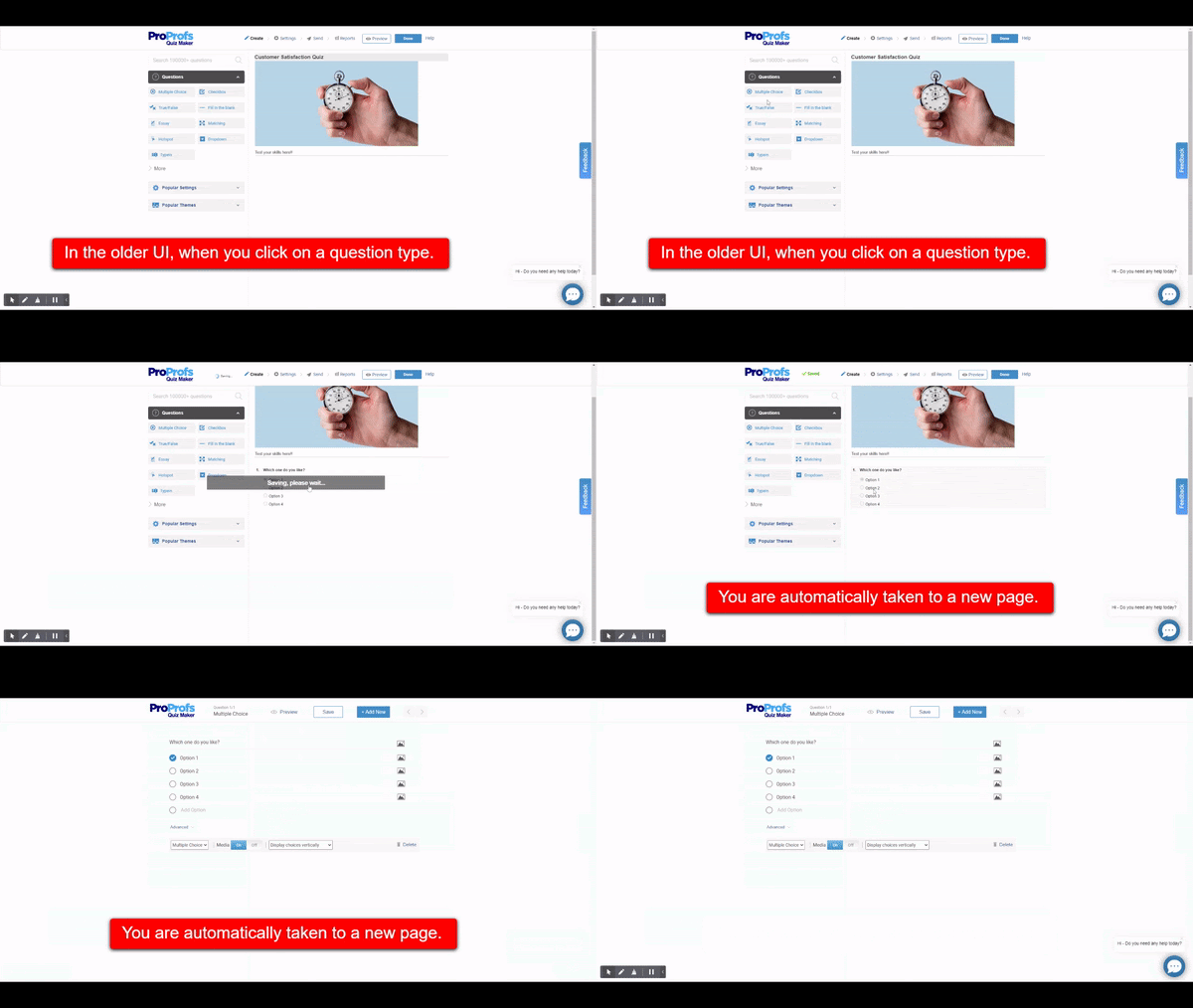
To your delight, our team addressed the issue in the new UI.
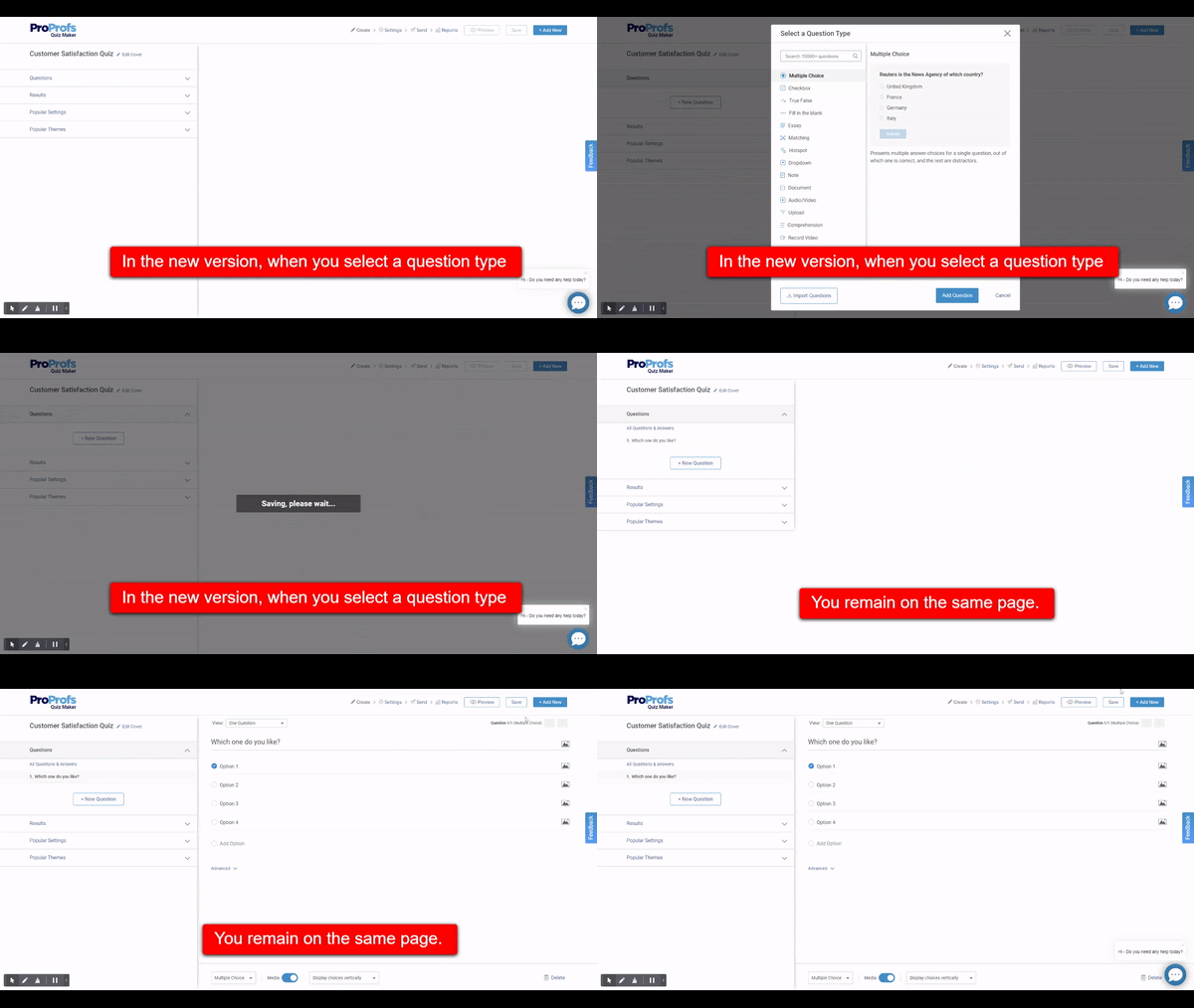
New Question Selection Window
Now select questions with clarity as to what a question type is and how it works.
A new question selection window welcomes you in the latest rollout, where you can search and find question types. There are explanations for each question type for you to make good use of them and create highly engaging quizzes.
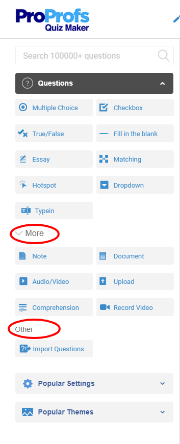
Here’s a before and after view of the question-type panel.
Before
After
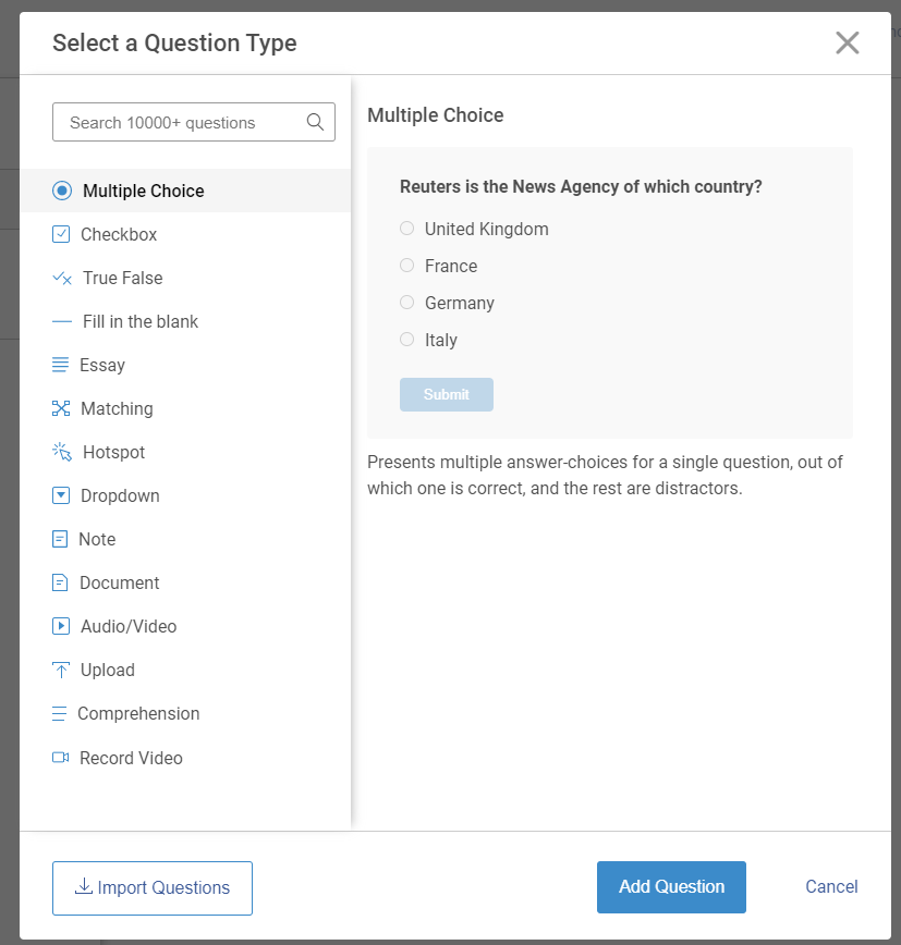
As you can see, in the ‘Before’ screenshot, there is an extra step to navigate to the ‘More’ and ‘Other’ sections. On the contrary, the new UI has a single palette of question types and a dedicated button to ‘Import Questions’ to simplify the overall process.
In the new UI, we doubled down on our existing features, such as choosing result types, giving a new theme to your Quiz, assigning points to the questions to make them better. The new UI makes Quiz editing simpler and faster.
-
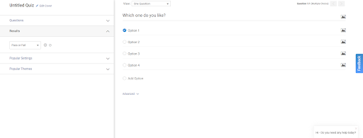
Choose or customize result types
Quickly locate the option to do this as it now appears on a side panel to the left.
-
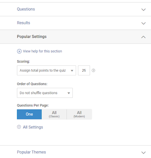
Simpler question settings
For you to quickly allot points and set the order of the questions.
-
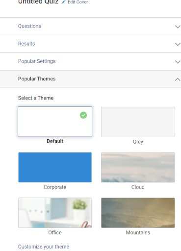
Assigning themes
Choosing themes for your quizzes will be easier now as it’s part of the quiz editing settings.
Modern UI
We strive to make your user experience better. The update takes care of minimizing user efforts in customizing the Quiz.
Presentation
You can simply choose to hide or display media with a toggle button and decide how you want to show answer choices in a click.

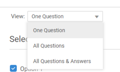
You can also choose from multiple ways to view questions. The view ‘All Questions’ makes it easier to see all the quiz questions on a single screen. In contrast, the other option, ‘All Questions & Answers,’ lists questions along with their answer choices in a single view. It can’t get any simpler.
What’s exciting, with more straightforward options and navigation settings, quiz editing will now take even less time than it did before.
As always, we would love to hear from you about the new updates, so keep sending us your feedback.
The new interface is all set to go live, and you’ll soon hear more details on what’s in store for you once the updates are in place.
For more frequent updates, you can check our News & Updates page.
