Statistics: Step-by-Step Data Understanding, Types, and Analysis
Lesson Overview
What is Statistics?
Statistics is a branch of mathematics that deals with the collection, analysis, interpretation, presentation, and organization of data. It encompasses a wide range of techniques and principles that enable us to make sense of numerical data and draw meaningful conclusions. Statistics is essential in virtually every field of study and industry, as it provides the tools necessary to understand and make decisions based on data.
Key Aspects of Statistics:
- Collection of Data: This involves gathering information from various sources. Data collection can be done through surveys, experiments, observations, and existing records. The quality and reliability of statistical analysis heavily depend on the accuracy and method of data collection.
- Analysis of Data: Once data is collected, it needs to be processed and analyzed. This involves organizing the data in a structured format, often using tables, charts, and graphs. Statistical analysis includes calculating measures of central tendency (mean, median, mode), measures of variability (range, variance, standard deviation), and applying various statistical tests and models to understand patterns and relationships within the data.
- Interpretation of Data: Interpretation is about making sense of the results obtained from the analysis. This involves explaining what the data reveals in the context of the research question or problem. Interpretation helps in understanding the significance of the findings and determining whether the hypotheses or assumptions were correct.
- Presentation of Data: Presenting data effectively is crucial for communicating findings to others. This includes creating visual representations such as graphs, charts, and tables that make complex data understandable. A clear and concise presentation aids in highlighting key insights and supporting decision-making.
What Are the Various Types of Data?
Data is the cornerstone of statistical analysis, and understanding its different types is crucial for selecting the appropriate methods of analysis. Data can be broadly classified into two main categories: qualitative and quantitative.
- Qualitative Data
Qualitative data, also known as categorical data, describes characteristics or qualities that can be observed but not measured numerically. This type of data provides descriptive information about the subject and can be divided into two subtypes:
- Nominal Data: Nominal data represents categories without any inherent order or ranking. Examples include:
- Colors: Red, blue, green.
- Gender: Male, female, non-binary.
- Types of Cuisine: Italian, Chinese, Mexican.
- Ordinal Data: Ordinal data represents categories with a meaningful order or ranking but the differences between the ranks are not uniform. Examples include:
- Education Level: High school, bachelor's degree, master's degree, doctorate.
- Satisfaction Rating: Very dissatisfied, dissatisfied, neutral, satisfied, very satisfied.
- Rankings: First place, second place, third place.
Qualitative data is often analyzed using methods such as frequency distribution, mode, and bar charts to summarize and present the information.
- Quantitative Data
Quantitative data, also known as numerical data, represents quantities or amounts that can be measured and expressed numerically. This type of data provides measurable information and can be divided into two subtypes:
- Discrete Data: Discrete data consists of distinct, separate values that can be counted. These values are often whole numbers. Examples include:
- Number of Students in a Class: 25, 30, 35.
- Number of Cars in a Parking Lot: 10, 20, 50.
- Number of Errors in a Document: 3, 7, 12.
- Continuous Data: Continuous data consists of values that fall within a range and can take on any value within that range, including fractions and decimals. These values are often measured rather than counted. Examples include:
- Height: 5.6 feet, 6.1 feet.
- Weight: 150.5 pounds, 175.2 pounds.
- Temperature: 98.6°F, 72.4°F.
Quantitative data is typically analyzed using methods such as mean, median, standard deviation, and various statistical tests and models. Visual representations like histograms, scatter plots, and line graphs are often used to present quantitative data.

What Are the Different Data Collection Methods?
The accuracy and reliability of statistical analysis depend significantly on the quality of data collected. To ensure robust and meaningful results, it is crucial to choose the appropriate method of data collection. Here are some common methods, each with its own strengths and suitable applications:
- Surveys
Surveys are a widely used method of data collection that involves asking individuals a series of questions to gather information. Surveys can be conducted in various ways, including:
- Questionnaires: Respondents provide written answers to a set of predefined questions. Questionnaires can be distributed physically or electronically (e.g., via email or online survey platforms).
- Advantages: Can reach a large audience, cost-effective, standardized questions allow for easy comparison and analysis.
- Disadvantages: Responses may be biased if questions are not well-designed, and low response rates can affect the representativeness of the data.
- Interviews: Data is collected through direct interaction between the interviewer and the respondent. Interviews can be structured (with a fixed set of questions), semi-structured (with some predefined questions and some flexibility), or unstructured (open-ended and conversational).
- Advantages: Can provide in-depth and detailed information, allows for clarification of responses.
- Disadvantages: Time-consuming, can be expensive, and potential for interviewer bias.
- Experiments
Experiments involve conducting controlled tests to gather data under specific conditions. This method is often used in scientific research to test hypotheses and determine cause-and-effect relationships.
- Controlled Experiments: Participants are randomly assigned to different groups, with one group receiving the treatment (experimental group) and the other not receiving it (control group). The outcomes are then compared.
- Advantages: High level of control over variables, can establish causality, replicable results.
- Disadvantages: Can be expensive and time-consuming, ethical considerations may limit the scope of experiments, and findings may not always generalize to real-world settings.
- Field Experiments: Conducted in natural settings rather than in a laboratory, allowing for the observation of behavior in a real-world context.
- Advantages: More generalizable to real-world situations, can observe natural behavior.
- Disadvantages: Less control over external variables, potential for confounding factors.
- Observational Studies
Observational studies involve recording data based on observations without manipulating any variables. This method is often used in social sciences, epidemiology, and market research.
- Naturalistic Observation: Observing subjects in their natural environment without interference. This method is used to study behaviors as they occur naturally.
- Advantages: High ecological validity, provides a realistic picture of behavior.
- Disadvantages: Lack of control over variables, difficult to replicate, potential observer bias.
- Participant Observation: The researcher becomes a part of the group being studied to gain a deeper understanding of their behaviors and interactions.
- Advantages: Provides in-depth insights, and allows for a comprehensive understanding of the context.
- Disadvantages: The researcher's presence may influence behavior (observer effect), and potential for researcher bias.
- Case Studies: An in-depth examination of a single individual, group, or event. Case studies are often used to explore new or unique phenomena.
- Advantages: Provides detailed and rich qualitative data, useful for generating hypotheses.
- Disadvantages: Limited generalizability, time-consuming, potential for subjective interpretation.
- Secondary Data
Secondary data involves analyzing existing data that was collected for a different purpose. Sources of secondary data include government reports, organizational records, and previous research studies.
- Advantages: Cost-effective, time-saving, and can provide large datasets.
- Disadvantages: Data may not be specific to the current research question, and potential issues with data quality and reliability.
Choosing the right data collection method is essential for obtaining accurate and relevant data. Researchers must consider the nature of their research question, the type of data needed, the resources available, and any ethical considerations when selecting a data collection method.
What Are the Key Concepts and Techniques in Statistical Analysis?
Statistics is a vital field that helps us to understand and interpret data, helping to make informed decisions based on solid evidence. This section introduces the essential concepts and techniques in statistical analysis, including descriptive statistics, probability and probability distributions, inferential statistics, hypothesis testing, and regression analysis. These tools and methods are fundamental for analyzing data across various fields, enabling clear insights and effective problem-solving. Some of the key concepts and techniques in statistical analysis are discussed below:
- Descriptive Statistics
Descriptive statistics involves summarizing and organizing data to make it easily understandable. Key concepts include:
- Measures of Central Tendency:
- Mean (Arithmetic Average): The sum of all data points divided by the number of data points.
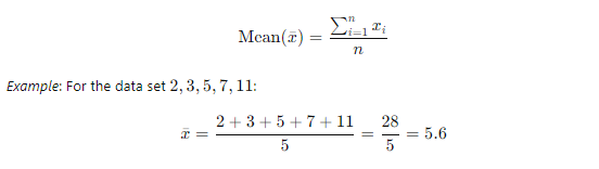
- Median: The middle value when data points are arranged in ascending order.
Example: For the data set 2,3,5,7,11 the median is 5. For an even number of data points, it is the average of the two middle numbers.
- Mode: The value that appears most frequently in the data set.
Example: For the data set 2,3,3,5,7 the mode is 3.
- Measures of Dispersion:
- Range: The difference between the maximum and minimum values.
Range=Max−Min
Example: For the data set 2,3,5,7,11
Range=11−2=9
- Variance: The average of the squared differences from the mean.
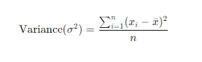
- Standard Deviation: The square root of the variance.
Standard Deviation(?) = √Variance
Example: ? = √10.24≈3.2
(118).jpg)
2. Probability and Probability Distributions
Probability is the measure of the likelihood that an event will occur. Key topics include:
- Basic Probability:
- Probability of an Event:

- Probability Distributions:
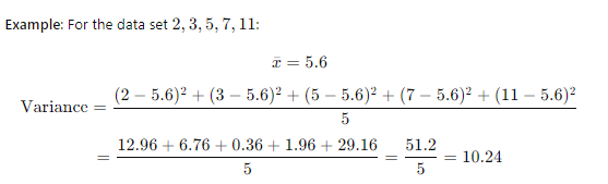
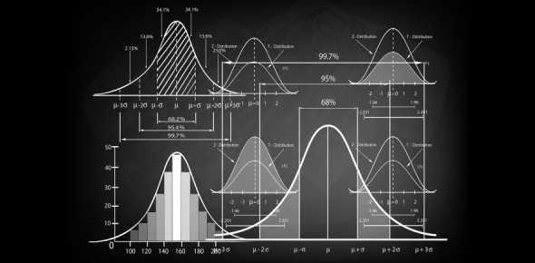
- Normal Distribution: Characterized by the bell curve, with mean ? and standard deviation ?.
Example: If ?=0 and ?=1 this is a standard normal distribution.
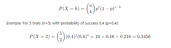
- Binomial Distribution: Represents the number of successes in ? trials with probability p of success in each trial.
3. Inferential Statistics
Inferential statistics involves making predictions or inferences about a population based on a sample of data. Key techniques include:
- Sampling Methods:
- Simple Random Sampling: Every member of the population has an equal chance of being selected.
- Stratified Sampling: The population is divided into strata, and random samples are taken from each stratum.
Example: To survey high school students, you could divide the population by grade level and randomly select students from each grade.
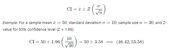
- Confidence Intervals:
- Confidence Interval for the Mean:
A confidence interval for the mean provides a range of values within which the true population mean is expected to lie, with a specified level of confidence (e.g., 95%). It is calculated using the sample mean, the standard deviation, and the sample size.
4. Hypothesis Testing:
Hypothesis testing is a method of making decisions using data. Key steps include:
- Formulating Hypotheses:
- Null Hypothesis (H0): Assumes no effect or difference.
- Alternative Hypothesis (H1): Assumes an effect or difference.
Example: H0: μ = 50, H1: μ ≠ 50
- Test Statistics:
- Z-test: Used when population variance is known.
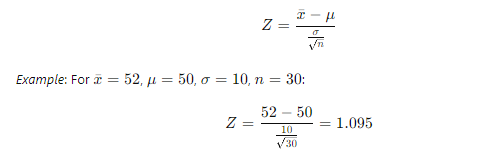
- t-test: Used when population variance is unknown.

5. Regression Analysis
Regression analysis is used to understand the relationship between variables. Key types include:
- Simple Linear Regression: Simple linear regression is used to understand the relationship between two variables: one independent variable (predictor) and one dependent variable (outcome).
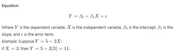
- Multiple Regression: Multiple regression is used to understand the relationship between one dependent variable and two or more independent variables. It is useful when you want to predict the value of the dependent variable based on several predictors.
(403).webp)
What Are the Various Types of Data Representation?
Representing data effectively is crucial for interpreting and communicating information clearly. Various methods can be used to visualize statistical data, each serving different purposes and offering unique insights. Here are detailed descriptions of some common ways to represent data:
- Bar Graph
A bar graph, or bar chart, uses rectangular bars to represent the frequency or value of different categories. The length of each bar is proportional to the value it represents.
- Usage: Ideal for comparing discrete categories or groups.
- Types:
- Vertical Bar Graph: Bars are displayed vertically.
- Horizontal Bar Graph: Bars are displayed horizontally.
- Grouped Bar Graph: Multiple sets of bars grouped together for comparison.
- Stacked Bar Graph: Bars are stacked on top of each other to show cumulative totals.
- Example: Comparing the sales of different products in a store.
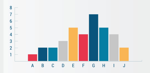
Fig: Example of a Bar Graph
- Pie Chart
A pie chart is a circular graph divided into slices to illustrate numerical proportions. Each slice represents a category's contribution to the whole.
- Usage: Best for showing the relative proportions or percentages of a whole.
- Components:
- Slices: Represent different categories.
- Labels: Indicate the category name and percentage.
- Example: Displaying the market share of different companies in an industry.
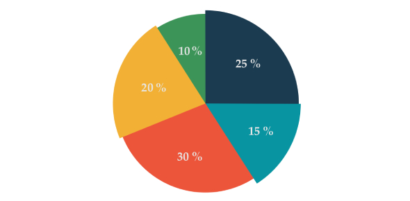
Fig: Example of a Pie Chart
- Line Graph
A line graph uses points connected by lines to show trends over time. It is especially useful for displaying data points at regular intervals.
- Usage: Ideal for showing changes over time or continuous data.
- Components:
- X-Axis: Represents time or another continuous variable.
- Y-Axis: Represents the variable being measured.
- Data Points: Plotted points connected by lines.
- Example: Tracking the monthly sales revenue of a company over a year.
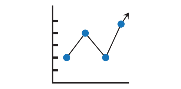
Fig: Example of a Line Graph
- Pictograph
A pictograph uses images or symbols to represent data. Each image or symbol corresponds to a specific quantity.
- Usage: Suitable for making data more engaging and easier to understand, especially for younger audiences.
- Components:
- Icons: Represent units of measurement.
- Key: Explains what each icon represents.
- Example: Illustrating the number of fruits eaten by students using fruit icons.

Fig: Example of a Pictograph
- Histogram
A histogram is similar to a bar graph but is used to represent the distribution of continuous data. It shows the frequency of data within specific intervals or bins.
- Usage: Ideal for displaying the distribution of a dataset and identifying patterns such as skewness or modality.
- Components:
- Bins: Intervals that divide the data range.
- Bars: Represent the frequency of data within each bin.
- Example: Showing the distribution of test scores in a class.
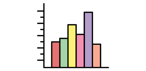
Fig: Example of a Histogram
- Frequency Distribution
A frequency distribution is a table that displays the frequency of various outcomes in a sample. It organizes data into categories or intervals and shows how often each category or interval occurs.
- Usage: Useful for summarizing large datasets and identifying patterns.
- Components:
- Categories/Intervals: Distinct groups into which data is sorted.
- Frequency: Number of occurrences of each category or interval.
- Relative Frequency: Proportion of the total number of occurrences.
- Example: Summarizing the marks of students in a school by intervals.
| Marks Obtained | Frequency |
| 50 | 7 |
| 60 | 8 |
| 70 | 10 |
| 80 | 14 |
Additional Concepts in Statistics
- Skewness
Skewness is a measure of the asymmetry of the probability distribution of a real-valued random variable about its mean. It indicates whether the data distribution is skewed to the left (negative skew) or to the right (positive skew):
- Positive Skew (Right Skew): When the right tail is longer or fatter than the left. Most data points are concentrated on the left.
- Negative Skew (Left Skew): When the left tail is longer or fatter than the right. Most data points are concentrated on the right.
- Zero Skewness: When the data distribution is symmetric around the mean.
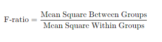
- ANOVA (Analysis of Variance)
ANOVA is a statistical method used to compare the means of three or more samples to understand if at least one sample mean is significantly different from the others. It helps in determining whether the observed differences among sample means are due to actual differences or random chance. There are two main types of ANOVA:
- One-way ANOVA: Compares means across one factor.
- Two-way ANOVA: Compares means across two factors and can assess the interaction effect between the factors.
- Degrees of Freedom
Degrees of freedom refer to the number of independent values or quantities that can vary in the analysis without breaking any constraints. They are crucial in various statistical calculations, including chi-square tests, t-tests, and ANOVA. Degrees of freedom are often associated with the number of observations minus the number of necessary relations among the observations. For example, in a simple linear regression model, the degrees of freedom for error are calculated as n−2, where n is the number of observations.
What Are the Applications of Statistics?
Statistics is applied across a myriad of fields, each with its unique requirements and methodologies:
- Economics: Economists use statistical methods to analyze economic data, forecast market trends, study consumer behavior, and inform policy decisions. Techniques such as time series analysis, econometrics, and regression models are commonly employed.
- Medicine: In healthcare, statistics is vital for designing clinical trials, analyzing medical research, and determining the effectiveness of treatments. Biostatistics and epidemiology are key areas where statistical methods are applied.
- Engineering: Engineers use statistics for quality control, reliability testing, and optimizing manufacturing processes. Statistical process control (SPC) and design of experiments (DOE) are important tools in engineering.
- Social Sciences: Sociologists, psychologists, and political scientists use statistics to conduct surveys, experiments, and observational studies to understand social behavior, attitudes, and trends.
- Business: In business, statistics is used for market research, risk management, and strategic planning. Techniques like predictive analytics, customer segmentation, and A/B testing help businesses make data-driven decisions.
- Environmental Studies: Environmental scientists use statistical methods to analyze data on climate change, pollution levels, and biodiversity. This helps in assessing environmental impacts and developing conservation strategies.

Conclusion
As we wrap up this course, you've gained essential skills in statistical concepts and techniques, from data collection and descriptive statistics to probability distributions and regression analysis. These skills will help you turn raw data into well-detailed and precise insights, enabling you to make logical and efficient calculations and solve real-world problems.
Understanding statistics is incredibly important for students. It enhances your academic performance, boosts your problem-solving abilities, and prepares you for various subjects and future careers. Your new skills in statistics not only improve your academic success but also give you the ability to think critically and analyze data effectively. Use this knowledge confidently as you continue your educational journey, becoming proficient and capable in handling data.
Rate this lesson:
 Back to top